Monday, January 11, 2016

Reflecting on Chicago's Past, Looking to Chicago's Future


Many years ago, architect Daniel Burnham built the City of Chicago.  Well, not personally, maybe—but we Chicagoans owe much to him nonetheless.  Having designed the city’s structural backbone, Burnham fashioned Chicago from a Midwestern locale to a true Metropolis, with a unique identity.  His hand quite literally drew Chicago up from the ashes of the Great Fire of 1871, officially commemorating its rebuilding from the fire by designing the magnificent White City of the World’s Columbian Exposition of 1893.  He truly lived by his words to “Make no small plans,” and he certainly set some big plans in motion for Chicago with these words in mind.

More than 100 years later, we are still attempting to truly realize (in both senses of the word--of understanding and implementing) this plea for our city.  Mayor Emmanuel’s 2012 Chicago Cultural Plan, recently drafted after months of hype, strives to continue in Burnham’s tradition.  It is long—some 67 pages of ideas and suggestions for the cultural betterment of the city.  The Emanuel camp also made an effort to be inclusive with residential Chicagoans, which opens nicely with pictures of Chicagoans who participated in the town forums held by the cultural committee.  The ideas and suggestions presented by these people are engaged by the Cultural Plan, positives:  engagement of "residents" looks pretty good--and sounds believable.  The opening pages displaying the pictures of participants and their thoughts, ideas and questions looks promising in terms of a co-commitment to cultural change.  It makes it seem as though they pursued all forums, rather than just the consulting firm Lord Cultural Resources, the go-to International (Canadian) firm for generating hype and cultural capital. And the draft ghost stamped on all of the pages serves as an invitation to all to digest this and change it as they wish during the new town hall meetings, to contribute to the final version.  With a little vivacity from cultural team leader Michelle Boone, and a little conviction, this could work.  

But let's hope the final draft has more direction than what is given here.  If these are to be our blueprints, how will we know where to start, with such vague "directions"?  Conviction would be favorable with these plans rather than the length presented as a substitute for commitment.  Sure, these plans are lengthy, but are they BIG, as Burnham suggests? Are they truly sweeps of change, or are they just small plans within a “big” shell?  Otherwise, without proper direction, the Plan could easily come off as feeling a little hackneyed—not unlike a brochure for buyers and investors, rather than a commitment to Chicagoans for the betterment of the city. 

In the "methodology" section (page 21), they refer to blueprints and building culture in this city from the bottom up...but this city doesn't need that.  We already have in place very beautiful and historically significant blueprints.  In 1909 Burnham released his Plan for the City of Chicago, to which we owe thanks for a central vein into the city (Congress Parkway), as well as the parks, beaches and harbors along the lakefront.  Beyond Burnham’s architectural contributions, these feats also carried social connotations, which are visually explained in his designs.  Notice the radiation, the symmetry, the movement implied in his designs of the streets and layout of the city.  This idea of symmetry was not merely geographical, but culturally intended.  It implies a shared cultural experience of the physical space—equality, among all peoples, races, classes.  These balanced designs were particularly impactful given the large influx of immigrants to the city at the time.  He did not reserve specific spaces for specific ethnic groups, as the city has tended toward in its growth since Burnham’s time.  He would not be content with the way that this incredibly segregated city has turned out in that area.  Note that his plans do not allocate a North Side and South Side; he does not designate Chicago’s present neighborhood factions. 

As Chicago looks to the future, it needs also consider its past.  Now that the dust from Burnham's original plans for our city have settled and the air has become stagnant, Chicago needs to reassume these designs and physically, culturally and socially put them in place once again.  We can build our city around Burnham’s idea: symmetry, equality, shared space. Burnham’s idea of our city as a “Paris on the Prairie” was not merely physical, but cultural as well. His oft-quoted command to “Make no small plans” was clearly meant for Chicago.

Footnote:

As another year begins, this idea of the Burnham Plan continues to influence Chicago.  Just last week, the Chicago Architecture Biennial ended, along with the 2015 Burnham Prize Exhibition. This celebration from the Chicago Architecture Foundation posed the question, "what is the state of the art of architecture today?," while inviting participants to exemplify "how groundbreaking advances in architectural design are tackling the most pressing issues of today."
As we've noted in the past, Burnham is an easy figure for we Chicagoans to consider when trying to address our pressing issues. But the emergent theme in recent years is that Burnham keeps getting used as a decoy. Burnham's 1909 Plan is still so bright and shiny and we are dazzled by the ideas. But we keep avoiding the hard work, and continue to make small plans.
As a city, we mistake the ideas and ideals presented in this Plan for being too dreamlike and unattainable. Rather, Burnham's visions were tender and ordinary, and arose from a true sense of practical need.  At a time when economic interest and the public good need unification the most, we can only hope but act on this design that continues to inspire us.


Monday, June 29, 2015

VACATION?!?

Vacationing in Vegas!

What do employees of Museum Explorer do on a long overdue and well-deserved (if not short) vacation to Las Vegas? Well, besides winning a little bit of coin playing the vintage Batman TV Show slot machine, they do what anyone would do--VISIT Museums! A couple months ago, we were lucky enough to head out to the Mob Museum and the Neon Museum while in Vegas.

Museum X's very own Liz Faron getting into trouble at the Mob Museum!
'Old Sparky'
The Mob Museum offers a fabulous and comprehensive look at organized crime in America. It is housed appropriately enough within the former Las Vegas Federal Courthouse, which was actually a location for hearings and trials on organized crime. The exhibits within the historic building include some of the most FUN interactives around, including an actual restored ‘Tommy Gun’, and ‘Old Sparky’—a replica of a prison Electric chair!  Below, you can see Liz testing out an actual restored 'Tommy Gun.'  When you pull the trigger, the sound of gun fire roars from speakers above your head and the whole gun shakes and rattles in your hands. And to our right we have Museum Explorer designer Rich Faron giving 'Old Sparky' a spin...  No kidding--when you pull the lever, the lights dim and flicker and the whole chair vibrates underneath you.  YIKES... Very effective!


Martini Glass sign restored and reinstalled by the Neon Museum just off Las Vegas Boulevard

The Neon Museum is a true treasure among museums. Affectionately referred to by the staff as the ‘Boneyard,’ The Neon Museum is a not-for-profit gem working to preserve the aesthetic history of mid-20th Century Las Vegas, as told through the artwork of its famous neon signage. The collection is extensive and is ‘stored’ outside. Given the dry conditions and low average humidity of the location, the collection is faring well. Most importantly, the Neon Museum takes seriously its commitment to ‘Collect, Preserve and Interpret’. In addition to its collecting, the museum has already undertaken the expensive and painstaking task of restoring many signs and returning them back into the community. The hourly tours offered are fun and full of great local history. Be sure to check out the local museums on your own trips this summer--and feel free to share them with us!  We LOVE museums!


Neon signs in the Boneyard at the Neon Museum
Catching the tour at the Neon Museum!
Liz testing out the Tommy Gun at the Mob Museum!

Tuesday, April 21, 2015

An Informal Education at the IMSS

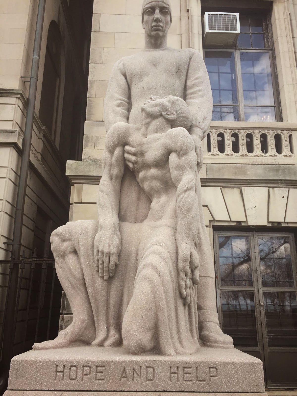
The Statue Outside of IMSS - Help to those who don't like science!

Last week we headed to the International Museum of Surgical Science, a true gem among Chicago's already impressive museums.  Located in a four-story Gold Coast mansion built in 1917, the building is an odd but perfect match for a medical museum. 

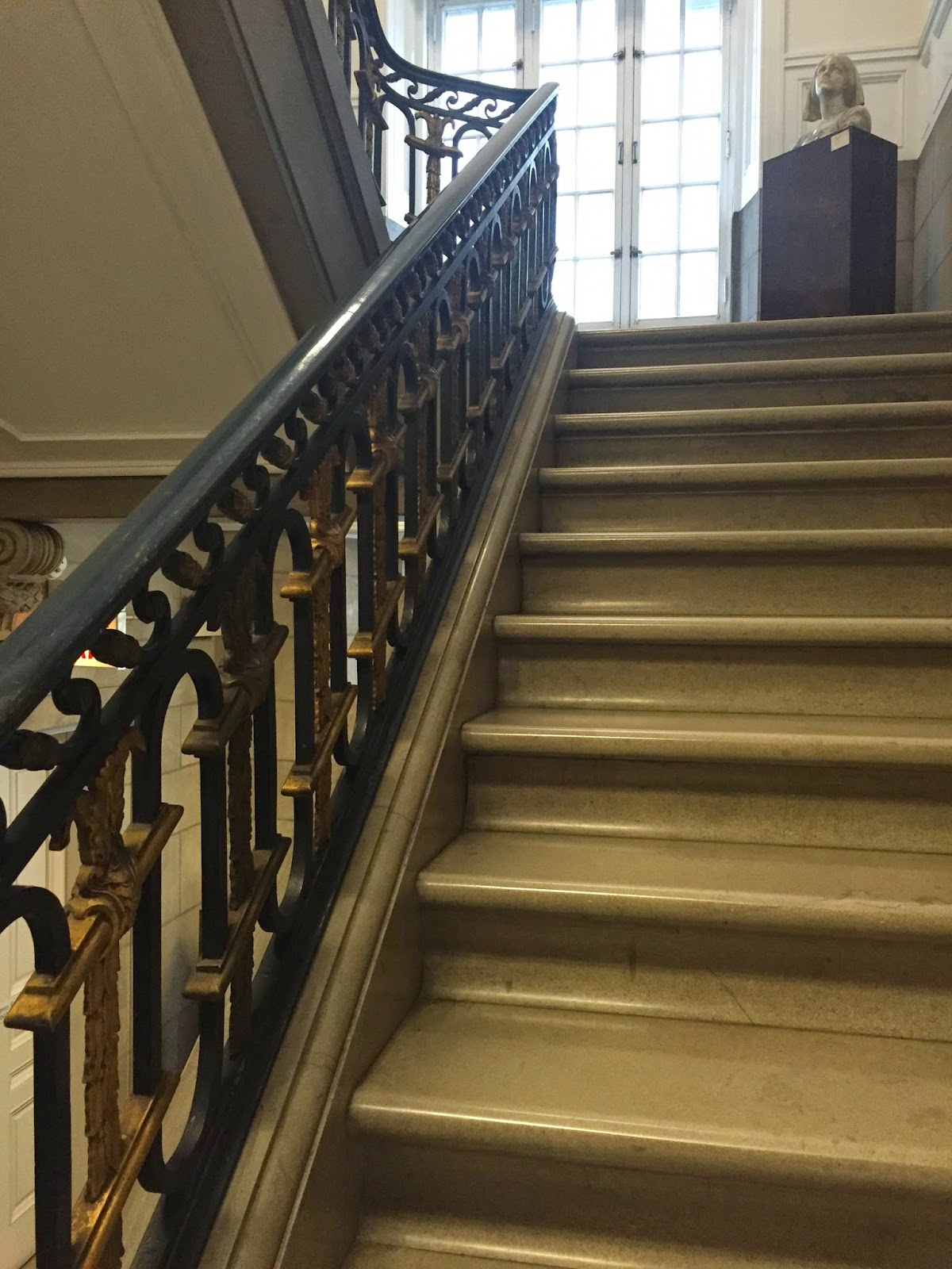
A Peek Up the Main Staircase
If you don’t happen to be a scholar in medicine or science, this place will quickly change your mind.  In fact, the museum is intriguing for its location alone (although it has plenty more to offer than that).  The building that houses the IMSS, now an official Chicago landmark, had originally been a residence built by Eleanor R. Countiss (daughter of a wealthy Diamond Match Company executive) in 1917, where she and her family continued to live until 1950.  It was designed with Louis XIV and Marie Antoinette in mind, and the building exterior to this day resembles a French chateau. Then, Dr. Max Thorek (founder of the International College of Surgeons) acquired the property in 1950.  Although he made some renovations to the interior during his first few years of ownership, the building still maintains many of its original decorative marble, plaster, and woodwork features, including the beautiful fireplaces on all floors, as well as the grand main staircase.  The museum opened its doors to the public in 1954, and has been welcoming guests ever since.  Despite its prominent location on Lake Shore Drive, overlooking the lake and only steps away from Lincoln Park, this museum is too often slighted in the shadows of its larger counterparts around the city.  We will take you through it in case you, too, have missed it!

On the first floor of the museum, tucked away in the far left corner off the main office, is an early 20th century pharmacy and dentist set up, called the “Turn of the Century Apothecary Shop” of Dr. Uriah Jones.  This is, at first glance, reminiscent of the “Yesterday’s Main Street” mainstay exhibit at the Museum of Science and Industry.  The IMSS takes this idea one step further—not only providing the environmental “feel” of yesteryear to the visitor, but by using the apothecary as a medium to explain to the visitor its social and medical properties (via an audio “tour” of the room).
Dr. Uriah Jones in his Apothecary

As an outsider to the medicine and science scholarly camp, this exhibit was a great introduction into the museum.  While science and medicine seem daunting, I can get on board with history.  The historical (almost theatrical) setup of the apothecary was entertaining, enough so that it allowed me to also swallow scientific information at the same time.  I hated learning about science in school.  It was too complicated to be interesting, and it’s not really a field that is learn-able on paper alone (which the schooling system relies too heavily on to teach to students).  Medicine, and science more generally, are more interesting to me now that an obscure knowledge of it isn't mandatory.  As an adult, I’ve found it's nice to have museums to offer that supplemental education, after formal education is offer. And, bonus, no student loans attached to learning in a museum!  

Fortunately the Museum of Surgical Science doesn’t resort to teaching or presenting science just on paper alone.  It has its four floors jampacked with artifacts and exhibits and information of all types.  Having been unfamiliar with this museum before my visit, I assumed the IMSS would be small, because it’s on the road less traveled (which, in terms of museums in this city, typically indicates the road north of Monroe Street).  I was very wrong. 

There was honestly enough variety that the museum could engage both those more learned visitors (there were many doctors, nurses and professionals in the medical field visiting), and those less familiar with the subject matter (me).  The historical approach to learning about medicine was pretty readily available throughout the museum, which was probably most engaging in the artifacts (especially the iron lung and Victorian-era wheelchairs).  Surprisingly to me, the IMSS also heavily incorporates art into its mission.  Most notable in this category is the “Artist Residency” special exhibit, a program the Museum has been fostering to lend Chicago-based artists an opportunity to learn and create art within its walls relating to medical history.  It is an excellent program, offering yet another means of interpreting medical and scientific knowledge to both the artists and the museum’s visitors. 

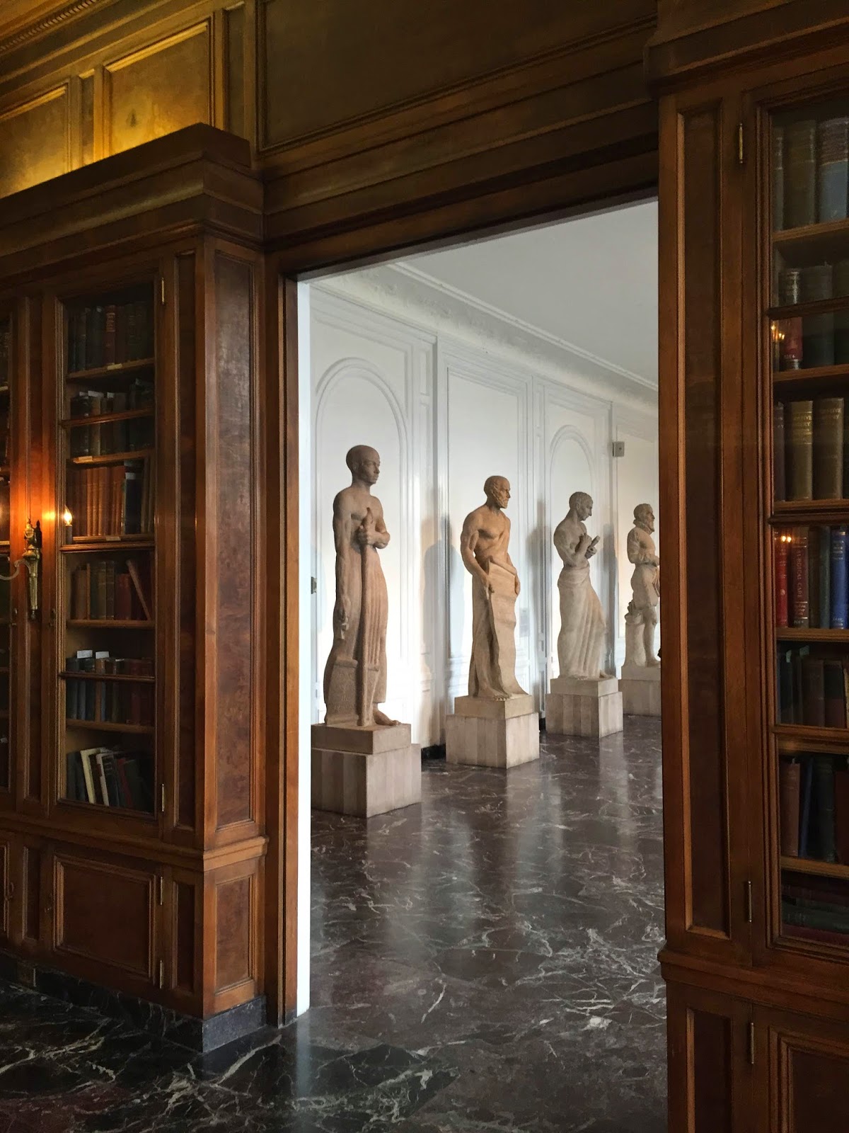
A Look into the Hall of Immortals from the Library
In a more abstract sense, the second floor of the museum is dedicated to various artistic depictions of Medicine’s “hall of famers.”  The Hall of Immortals, as it’s called, features compelling sculptures of some of Medicine’s more notable contributors, including Imhotep, Marie Curie, and Andres Vesalius.  These sculptures by Chassaing and Linck are accompanied by nothing more than the natural lighting provided in the Hall, and some salient museum labels (actually I would argue the IMSS had the best museum labels throughout).  Though simple, is a pretty dramatic presentation that sticks with the visitor as you go on to other floors to learn more specifics about the Immortals’ contributions.  And on your way back down that grand staircase, you realize that you truly have learned more about medicinal history on those four floors than any textbook alone could teach you!


Tuesday, March 24, 2015

An Unseasonable Trip to the Nature Museum


We were going to write a “nice weather” post today... But who's in the mood for that now!  Just this past weekend we have been unkindly reminded that winter is still sticking around—which was the inspiration for using this great seasonal comic (here for more). So, instead, our next couple posts will be wrapping up our winter museum travels (along with the winter weather, we hope)!

A view overhead of the produce vendors in the lobby
Although spring has officially begun, it is still the off-season for many of Chicago's best nice weather features--the beaches, city gardens, and farmer's markets.  For those of you who didn't know, Green City Market (which is Chicago's premier farmer's market) continues to run even during the off season.  Their winter farmer's markets are held indoors, at the Peggy Notebaert Nature Museum! This museum collaboration makes sense for a couple reasons: 1) it’s a nature museum, so why not hold farmer’s market there celebrating nature’s yield; and 2), the place is such a beautiful space to begin with, and one of few places that could still offer you a chance to connect with nature during the winter, when most things outside in this city seem dead.  We were itching to get back into the swing of the farmer’s market season—plus, who doesn’t love an excuse to head to Peggy Notebaert?


Before the clouds came
Unfortunately, winter weather reared its ugly head again last Saturday.  Although it looked like it could have been a lovely sunny day, the skies became cloudy and the day was soon overcast (foreshadowing the collective mood of the city before the snow hit—see attached photo).  But the Nature Museum is built to make the most of the sunlight hitting Lincoln Park, so it was still bright inside.  The produce vendors were stationed in the main lobby of the museum, although this too was a reflection of the slow transition from seasons.  Not much produce was available beyond potatoes and mushroom (of which there was a great selection), so the Market had beefed up their vendor selection with heavier items more likely to help you cope with Seasonal Affective Disorder.  There were quite a few vendors selling bread, pastries and fried items.  Let it be noted that those items are always available at Green City Market, no matter what season.  It’s just that the SAD on this day made those items more attractive and obvious.

Owl Turd Comix
Overall, it was still a great trip out, even though nature’s yield wasn’t particularly high on Saturday.  It was nice to be able to go to a museum for something that was totally not museum-related, and then still have the opportunity to be able to tour the exhibits afterward.  In fact it almost made the Nature Museum seem more like a community center—having many guests there for various reasons.  So many young parents and younger children roaming around the place for learning opportunities, while other folks were there solely for the farmer’s market offerings.  To have the place be that busy before it was technically even open (the farmer’s market starts at 8am, while the Museum doesn’t officially open until 10am).  Fortunately the Museum staff was there early, and was kind enough to open up the Butterfly Haven early.  After we perused the vendor stands in the lobby and in the upper level, we were able to have the Butterfly Haven basically to ourselves.  It’s already such a peaceful place there, but it was nice to have it away from the crowds, too—an opportunity not often afforded in a Chicago museum on a Saturday.  So, thankful to this collaboration with Green City Market for a more personal experience at the Nature Museum!

While the not-Spring weather is still around, the Green City Market will be held indoors through the end of April (the outdoor market season starts in May).  There are two more opportunities for you to visit the indoor market at the Peggy Notebaert Nature Museum.  For more info, check out the Nature Museum’s website here,  and Green City’s website here.


Saturday, January 17, 2015

Frank Lloyd Wright's Beacon of Light: A Step Back in Time Inside the Robie House

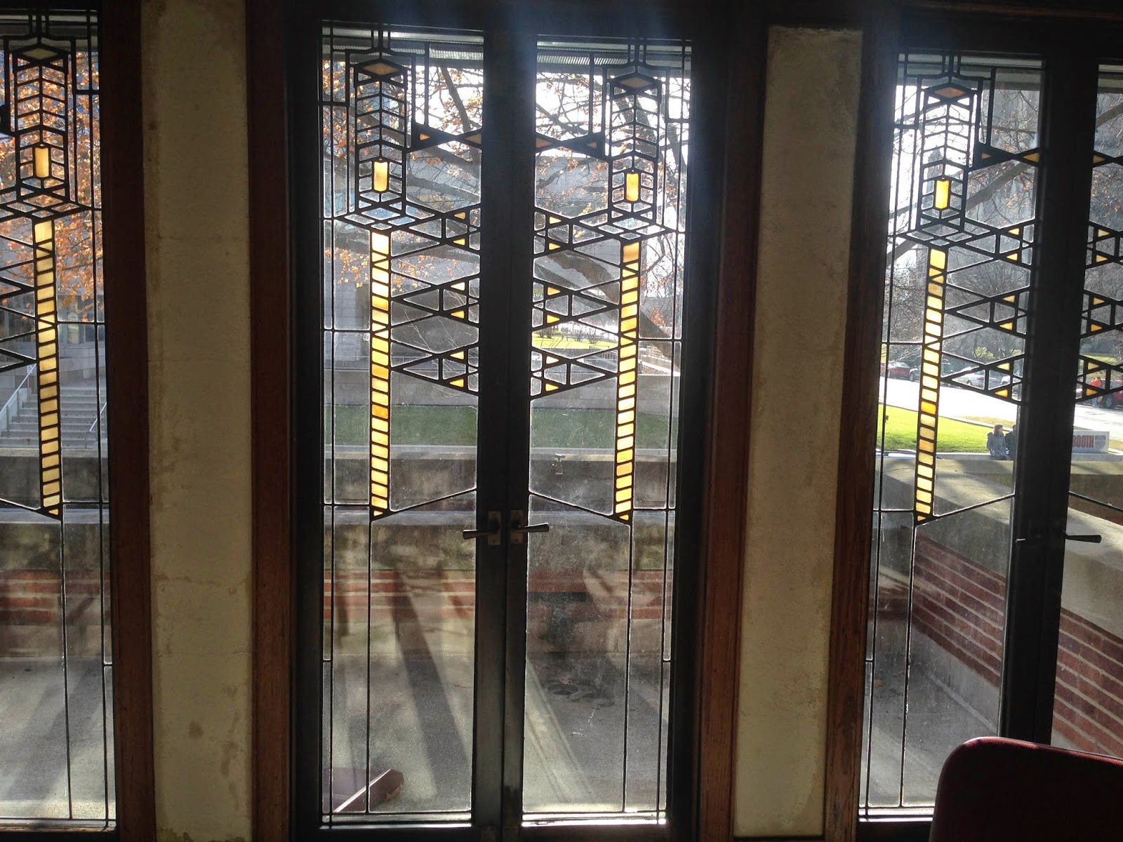
The "Wall of Light":  Art Glass Windows on the South Side of the Robie House

I've always felt that Hyde Park was one place in which you can still feel the presence of old Chicago (see our post on the 1893 World's Fair HERE).  One of the older suburbs of the city (which it remained until Chicago officially annexed it in 1889), Hyde Park maintains many of its old vestiges.  Driving south of the city nearing its Midway Plaissance, the lake seems calmer, and it seems a little quieter amid the park grounds, old homes and university campus in the area.  Hyde Park still has that old feeling to it which is both urban Chicago and suburban at once.

It’s no wonder, then, why a budding businessman, husband and father of two young children would select the location for his home to be built.  Frederick C. Robie commissioned Frank Lloyd Wright for the job some time during 1908, and construction began on the Robie House in 1909.  Wright’s Prairie style gem was completed in 1910, now over a century ago.

The history of the house itself is pretty fascinating, having changed hands several times in the subsequent decades (once even having served as a dormitory!).  Today it is operated exclusively by the Frank Lloyd Wright Trust.  It stands as a tribute to Frank Lloyd Wright, an exemplar of some of his best and most iconic work.
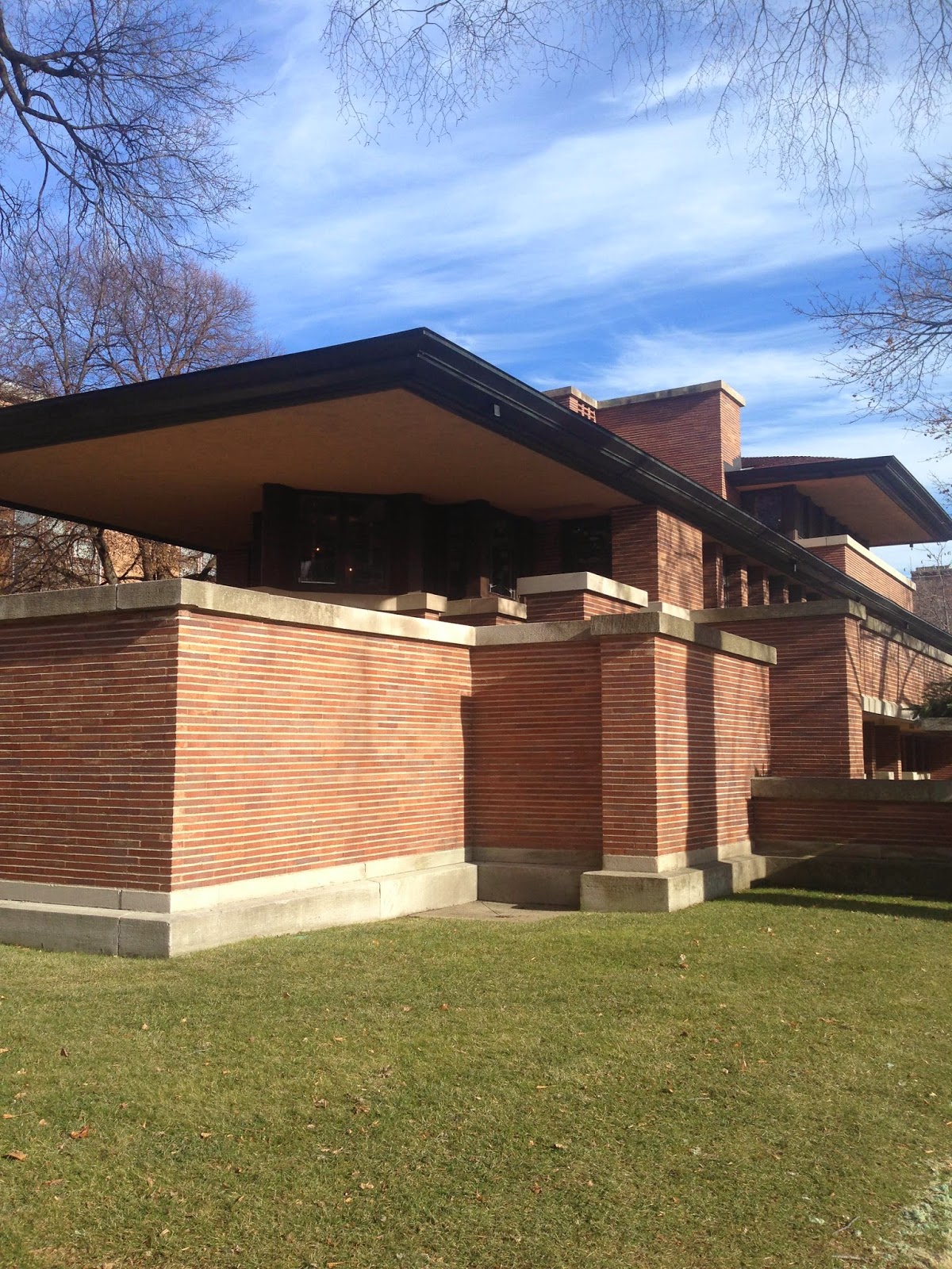
The Frederick C. Robie House, as seen from outside
In fact, even today, the house stands out in the neighborhood.  While there are now newer and more modern-style buildings around than there were in 1910, the Robie House still shines among them as an example of modern architecture.  Just think, how unique the style was for 1910!  It would have been alone amid the other Queen Annes, Victorian style homes which were in fashion at the time.  The straight lines and cantilevers on the Robie House were quite the converse of the neo-Gothic curves on the Queen Annes. 

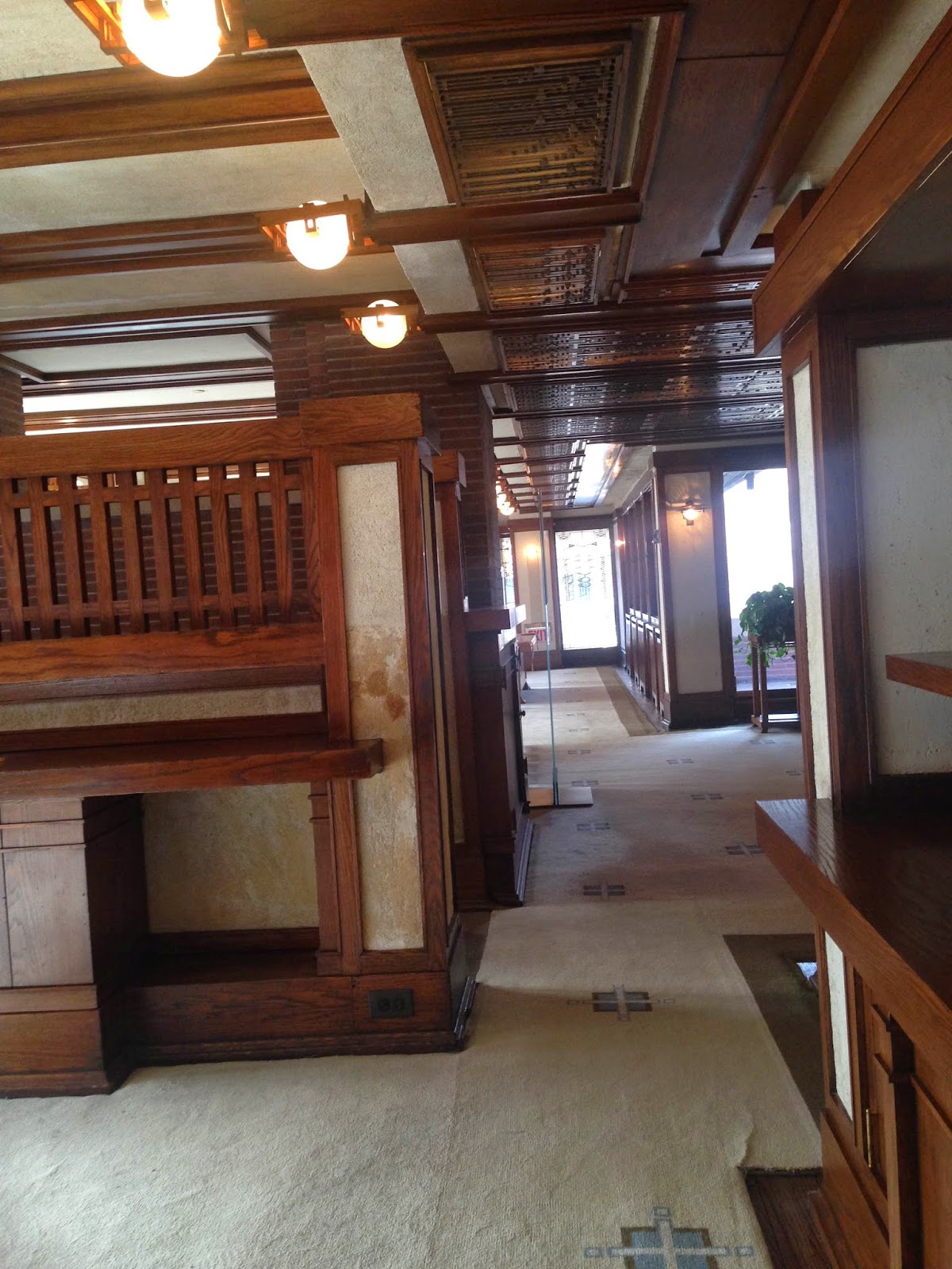
It’s something really incredible to be able to forge a connection with the past, and in the Robie House, it’s like taking a step back in time.  The Frank Lloyd Wright Trust guides offer a fascinating tour of the place.  They are quick to point out the nuances of the house, and made it so easy to see the genius in Wright’s designs there.  Actually, it’s hard to believe that this place is over 100 years old, given the forward thinking in the design, the modern straight lines throughout, and the incredible built-in functionality of the house.  Among my favorite features were the “hidden” radiators, designed by Wright to be encased in decorative wooden covers so as to unify form and functionality.  There are plenty more points like this in the house, such as the outdoor planters that are built into the home, replete with their own irrigation system!  Frank Lloyd Wright didn’t skimp on the details in the design of this home.
Paint swatches are visible here
Also noted by the tour guides, and obvious to the naked eye, was the disrepair of the house.  This was obvious in the broken, exposed wall sconces, the in progress paint jobs occurring on the walls, the windows being replaced.  That is not to say that the Robie House is in any state of ruin—repairs are being made and restoration is in progress, fear not.  It was just so striking to see the wear on the building throughout the tour.  Maintenance is not something museum goers ever really get to witness or have to think about, because that’s usually done behind closed doors, after hours.  But in this case of the Robie House, the museum and exhibit is the venue itself.  The tour pointed out how much upkeep is required to preserve a building in its original state, and just how much work the Frank Lloyd Wright Trust has to do to keep Wright’s beacon shining.


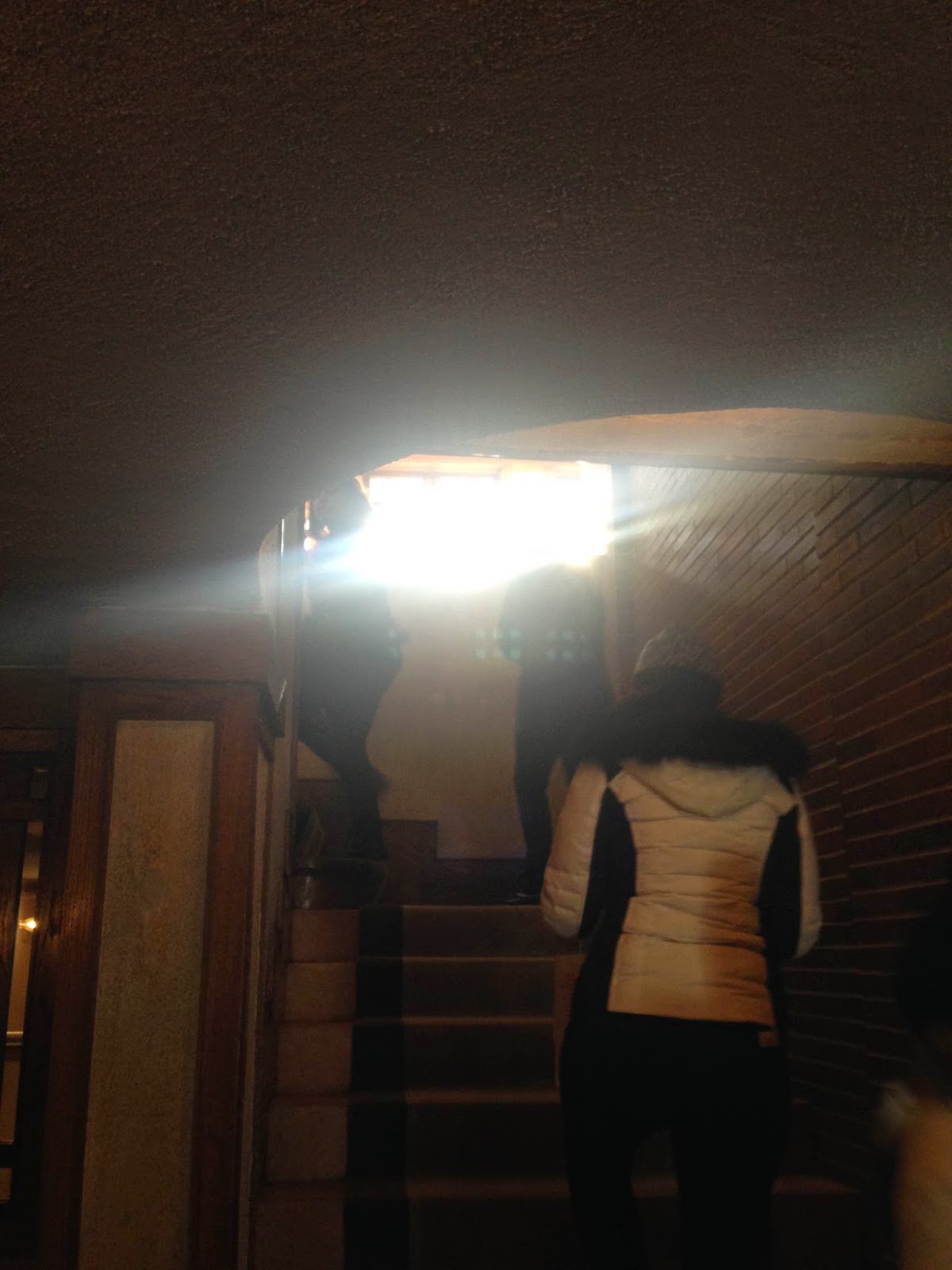
Light peeking on the Stairway
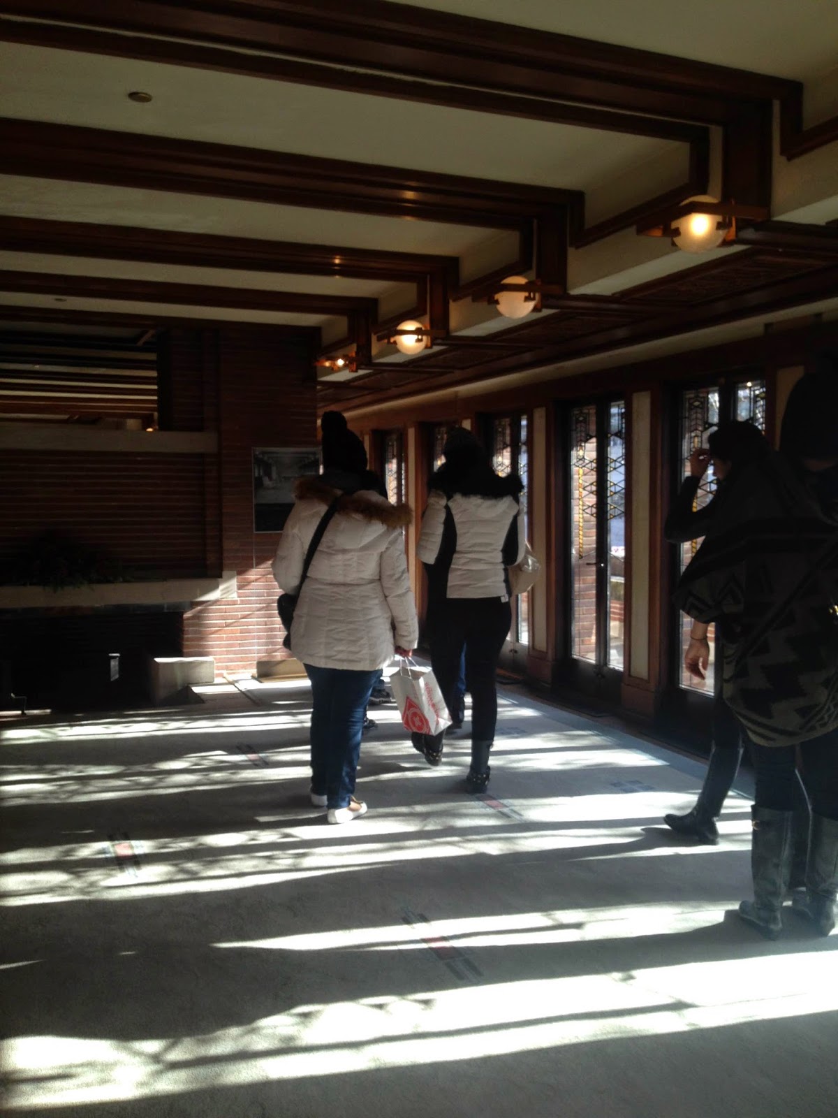
But that's not to talk down its beauty. I snapped some unauthorized photos during the tour, and if nothing else, you can clearly see from these pictures that the lighting in this house is gorgeous.  The first photo above shows the lighting from the staircase of the original main entrance of the home leading up to the living room.  In order of the tour and the progression through the house, next is the “wall of light,” the literal wall of windows on the south side of the home that runs from the living room and the dining room.  Fortunately on the day of this tour a few weeks ago, we had great sunlight, pointing out that shining is something that the home still does well, even after a century.


Walking from the Living Room to the Dining Room, through the Light

Saturday, January 3, 2015

Reflection for the New Year


Happy New Year to all you MuseumX fans!  For our first post of 2015, we (predictably) will be doing some reflecting on the past…  Although we are going back kinda far this New Year—from 2015 all the long way back to 1968.

As 2014 has come to a close, so too will “The 1968 Exhibit” at the Chicago History Museum (tomorrow is the last day to catch it!).  Fortunately we did not drop the ball before the ball dropped - we were able to attend a special viewing of it last month!

To be honest, I was not thrilled about the subject matter of this exhibit, solely based on personal preferences.  The 1960’s are generally a period of American History I have always been uninterested in.  My parents are products of the mid-60’s, and my mother is nostalgic, so she always had on TV sitcoms from the era..  As a kid, these bugged me because they were A) not animated and B), unbelievably not-funny.  So much of what I reluctantly digested from the 60s, I disliked, because it was not relatable.  As I grew older and learned more about the Civil Rights Movement, the American political system, the Vietnam War, my disinterest was sustained.  What a sad, sad time.  To have an exhibit that highlighted so many of these central events and themes of the 1960s, was not that exciting to me.  Fortunately, my mind was changed very quickly upon entering the gallery in the Chicago History Museum.

The foremost recollection of this exhibit is the entrance, because it is so striking.  The first space within ‘1968’ is at first, a normal living room by 1960s standards: golden brown, straight lines, wooden furniture, more shades of brown, and, a television set.  Next in the order of the living room properties is an actual “Huey” helicopter, to denote the heavy presence of the Vietnam War in the thoughts (and tv sets) of Americans during the war.  It’s a powerful and provocative image.  The staging in ‘1968’ is pretty well done elsewhere in the gallery, too—my favorite “scene” is the desk of a typical young woman in her 20s during the 1960s.  While the technology has shifted a bit from the blue typewriter featured on this desk, I can firmly say that the general set up of the room (political posters, colors, birth control) remains the same (being friends with several female new-age hippies currently in their 20s).

Desk of a "Modern Woman," from 1968
Actually, this very characteristic of ‘1968: The Exhibit’ to me is what was most surprising, and most rewarding: the events presented during 1968 are presented in such a way that they are totally relatable to the happenings of 2014.  While ‘1968’ is nostalgic to many of the museumgoers that lived through the year themselves, I have no personal ties to the 60s.  Although I was not really turned on by the subject matter of the exhibit, I was able to enjoy myself moving through the year of 1968, both learning new information about these events, and relating them to events that are happening this day in age.


One of the many graphics on Race Issues in 1968
At no point was this relatability more clear than at the station in the exhibit dedicated to Martin Luther King, Jr.  Watching the featured documentary clip, listening to his words on oppression, violence and peace, was so eerie.  The violence and racism of which he speaks has not really changed at all, although 46 years have passed since that time.  Ambling through the exhibit, you will see words like “police brutality,” “violence,” “racism,” and “equality” appear at multiple points during that year.  Although the exhibit provides great context for these words and corresponding events, none is needed.  These words, these struggles and instances, are still occurring.  In light of the recent tragedies in Ferguson and New York, to name just a few, it was striking to look upon these acts of violence that happened in 1968 and know that we have made little progress since. The Civil Rights Movement remains ongoing all the way into 2015.  I was grateful “1968” was able to make me look at my own day in age differently.


Food for Thought: Up top, from 2014, below, from 1968

Friday, December 19, 2014

How Lovely Are Your Branches: A Christmas Trip to the Arboretum


Earlier this week, you may have noticed, we trekked to the Morton Arboretum.  That’s right—it is December, and it was a mere 30° outside, but what a night!  We went to see the “Illumination” exhibit at the Morton Arboretum, a mile-long stretch of trees decked out in all kinds of lights and color. 


These were not just any Christmas lights!  Although there were plenty of conifer trees on display, the lights shone upon trees and hedges of all sizes and shapes at the Arboretum.  It was literally like walking through the Disney classic “Fantasia,” what with all the incredible colors and the Classical music (from our very own Chicago Symphony Orchestra!) being played from the speakers.  The ‘Symphony Station,’ which you see pictured to the right and above,
 was particularly awesome.  This was a new addition to “Illumination” this year, with the lights both on the floor of the forest (!) and those projected on the trees synching up with the Classical music.  Just incredible.


Here are some more photos from our tour of “Illumination,” but try and get to the Morton Arboretum to see for yourself—you only have until January 3rd!